17 times when the chosen design proved to be exactly the right one!
Advertisement
Have you ever been struck by a product not so much for its usefulness as for its design? Those who work in the sector are aware of the power of giving an object a curious and interesting appearance, even if the product itself is not.
It is not just a way to sell more, it is often a way to make a product appealing and therefore make it not only useful but also beautiful to see.
These that we present in this article are examples of the times when the design chosen was exactly the right one!
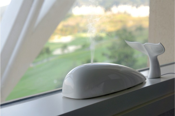
A whale-shaped aroma diffuser --- the spray of vaporized essential oils mimics perfectly a whale spraying water!
Advertisement
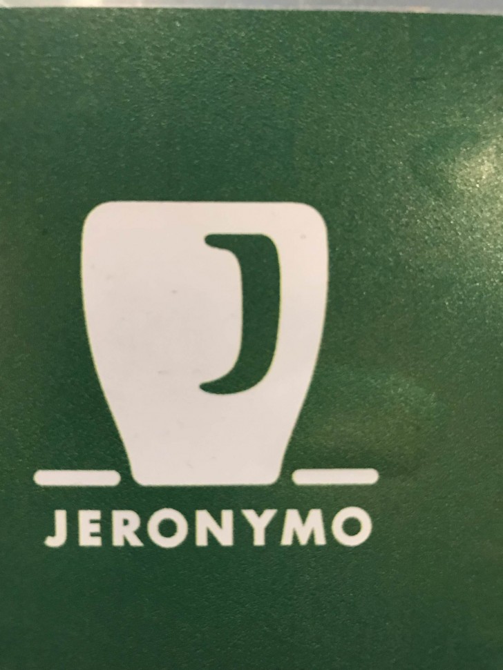
The logo of this coffee bar represents a cup of coffee and the reflection is the letter "J", the initial of the name of the place.
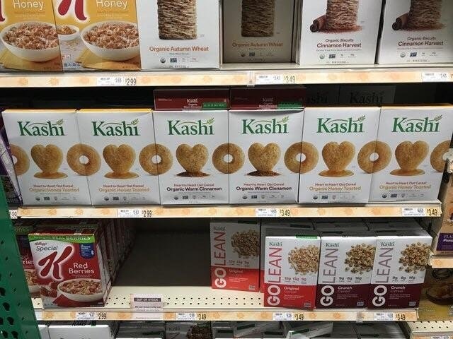
The packaging of these cookies match perfectly when the boxes are placed side by side.
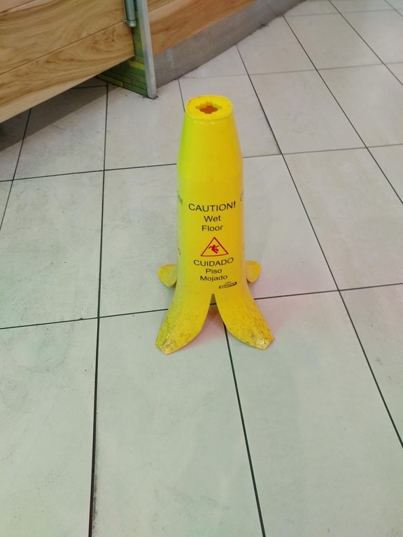
The wet floor sign finally becomes international! Everyone can understand its meaning!
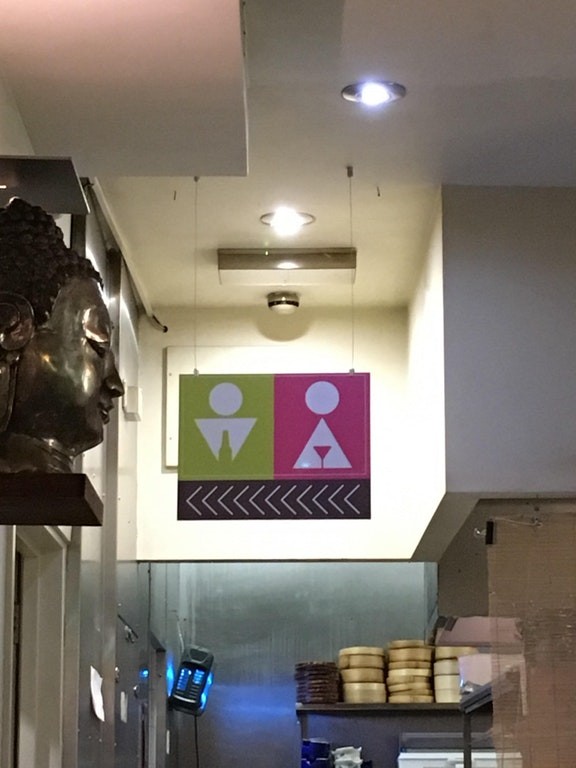
These symbols are used to indicate the toilet for men and women in this place.
Advertisement
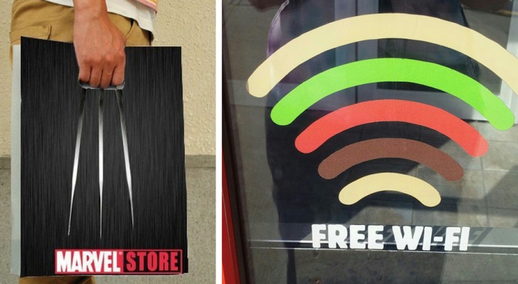
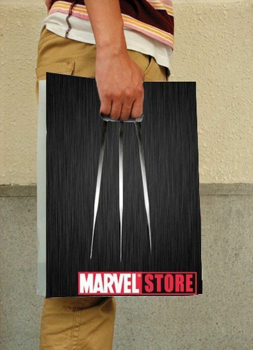
Marvel chose this design for advertising their stores on their shopping bags.
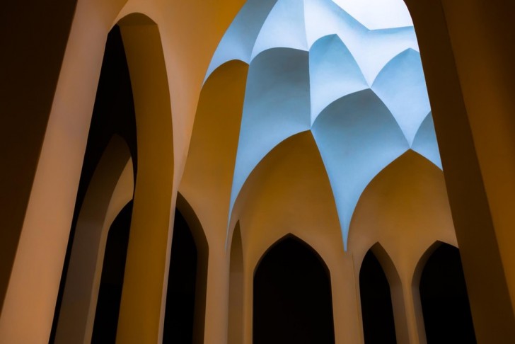
The perfect colors of this mosque.
Advertisement
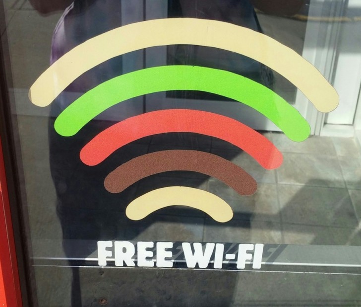
This symbol for Wi-Fi reminds you of a tasty sandwich!
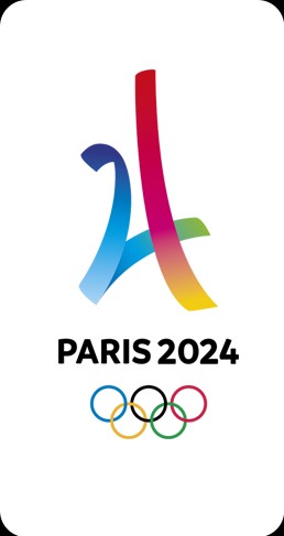
The symbol of the Olympics to be held in Paris (France) in 2024. The logo recalls the numbers 2 and 4 and also the Eiffel Tower.
Advertisement
This chicken coop has the shape of a spaceship.

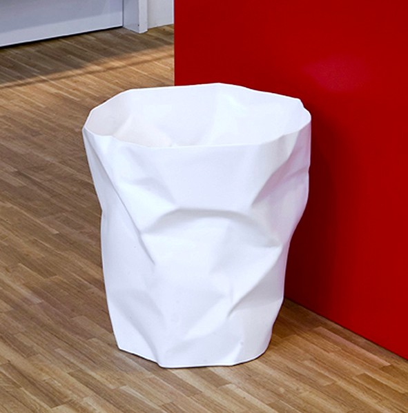
This wastepaper basket seems to be made out of a sheet of crumpled paper.
Advertisement
The entrance to a chapel inside a hospital.

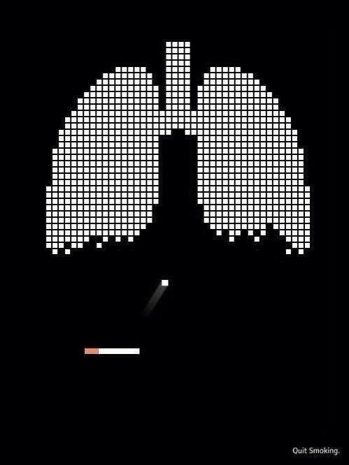
The most effective advertising against smoking ever.
Advertisement
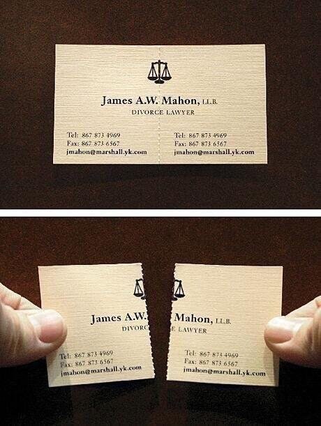
The business cards of this divorce lawyer.
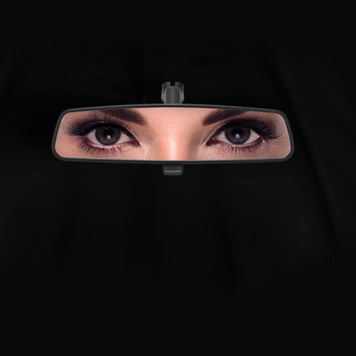
This publicity was disseminated following the approval of the law that allows women to drive in Saudi Arabia.
Advertisement
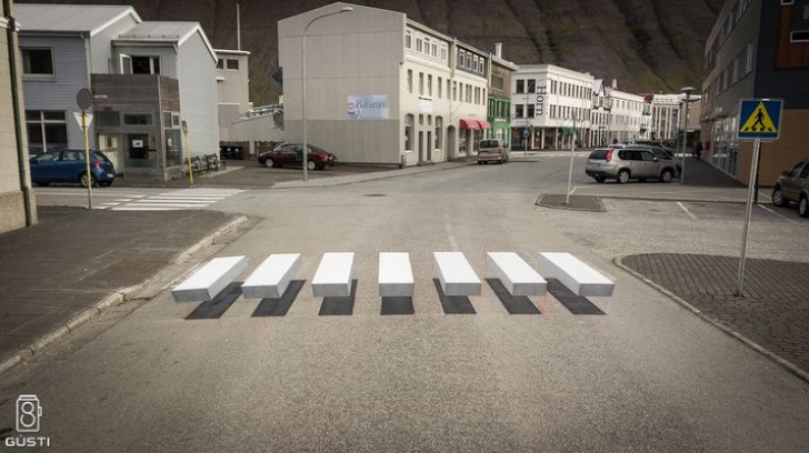
These 3D crosswalks cause drivers to slow down.
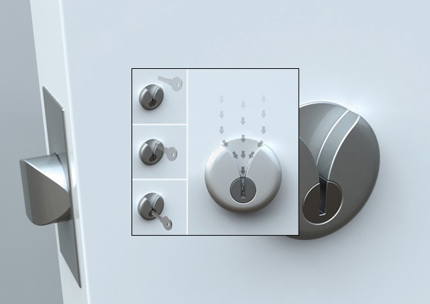
This lock was designed for the blind and for anyone who is drunk!
Advertisement
